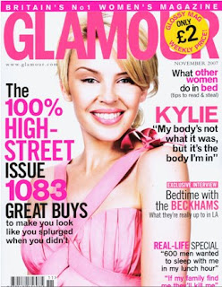
The first  magazine I chose was glamour. This magazine is obviously aimed at females, young women interested in fashion, beauty and a contemporary lifestyle in particular.
The first noticeable aspect is the colour theme, an array of pink fonts contrasting with black. The colour pink is typically related with girls and bodes well with Kylie Minogue’s dress, lipstick and eye shadow. The colour could also be related with Kylie’s battle against breast cancer and the colour of the ribbon that represents cancer research. This ties in with quote placed underneath “KYLIE”, one of the main focus’s of the cover, reading “My body’s not what it was, but it’s the body I’m in” this grabs the readers attention as many women are body conscious and in 2005 more than 45,500 women were diagnosed with breast cancer which is the equivalent to around 125 women a day which is large amount and is a current issue.
Across the very top of the magazine, in perhaps the brightest shade of pink is a strap line that reads “
The title of the magazine is in large, bold, uppercase letters in a simple font, and overlaps the top of Kylie’s head, again in a pink colour in keeping with the rest of the magazine. Overlapping the title is a yellow circle with “only £2” written in black, the word only making it seem a small price and the circle shape makes it look like a sticker, as if the price has been reduced.
Underneath the title is the website and year/month of issue in a conventional magazine style, in a times new roman type font, the month is also in uppercase.
The main article is on the right side of the page and takes up about two thirds of the length of the magazine and is in bold uppercase. This font, bar the title, is the largest on the page drawing lots of attention. The “100%” makes it feel impressive even before you know what is says, then the number “1093” framed by black writing stands out and makes it seem somewhat remarkable, especially followed by the word “great”.
The tags to the left side of the page are all the same colour theme, interchanging with the pink and black font. The top one reads “what other women do in bed (tips to read & steal)” this is always a concern in women in this day and age, and they love to read about it. Highlighting the words other, women and bed make it easier to know what it’s about and let the buyer make a quicker decision whether to buy the magazine.
The pink on white, as seen previously along the top strap line, is used again to promote the interview with the “Beckhams” in pink and uppercase, and the word “exclusive” meaning only Glamour have the interview makes it seem special and exciting. The other two remaining article advertisements follow suit.
 Rolling Stone is a United States-based magazine devoted to music, politics, and popular culture that is published every two weeks. Rolling Stone was founded in San Francisco in 1967 by Jann Wenner (who is still editor and publisher) and music critic Ralph J. Gleason. The magazine was known for its political coverage beginning in the 1970s, with the enigmatic and controversial gonzo journalist Hunter S. Thompson. Rolling Stone changed its format in the 1990s to appeal to younger readers, often focusing on young television or film actors and pop music. This led to criticism that the magazine was emphasizing style over substance. In recent years, the magazine has resumed its traditional mix of content, including in-depth political stories, and has seen circulation rise.
No comments:
Post a Comment