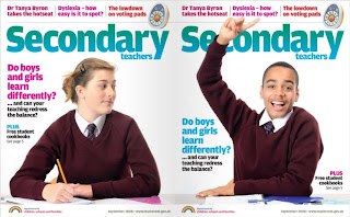
In this blog entry I am analyzing the font cover of the magazine “Secondary Teachers”. Secondary Teachers magazine is for the teaching professional. It aims to be balanced, inspiring and useful, with practical solutions and the inside track on Government education policy.
The first thing that stands out is that the font cover continues onto the back cover, this instantly intrigues the reader. This works well with the main article advertised as it is about exploring whether gender affects learning, hence the boy on one side and a girl on the other. The model children are the main focus of the cover as they take up most space and they are positioned in the center of each page, leaving space for the title of the magazine, although on the boy’s side his pose entails a raised hand which overlaps the “c” of “secondary” but his arm is cleverly arched to form the same curve as a C.
The poses of the models are the most important feature in this case. The girl’s pose is more poised and her facial expression and body language is much less enthusiastic than the boy’s, perhaps suggesting girls are reserved or defensive than boys, as her arm is blocking the space between her and the boy’s, whereas the boy’s posture is much more open, or maybe boy’s are more comfortable with sharing idea’s or answering questions, evidently provoking thoughts on the article.
The main article heading is, generically, pink on the girl’s side and blue on the boy’s. They are in the same simple font, bold and a medium size with letters spaced closely together. It reads “Do boys and girls learn differently?” The use of the question mark works effectively as this is the part that provokes thought, even though it is a rhetorical question as underneath the main article heading, in black after an ellipsis, it reads “and can your teaching redress the balance?” Clearly the answer to both questions is yes otherwise the article would be pointless.
Towards the outside of the of the page there is a plug offering free student cookbooks, you’re drawn in by the uppercase, bold “plus” which is the alternating colour to the main article heading and the same font. The title of the magazine “Secondary teachers” is in two different sized fonts “secondary is large and the main word, and “teachers” significantly smaller. The colour of the title graduates from turquoise to an aqua blue, which typically are thought of as “boy” colours, but this is weighed out by the advertisements of other features in the magazine stated above the title at the very top of the page.
No comments:
Post a Comment